["bug"] Chart tooltip and chart description use different rounding #237
Description
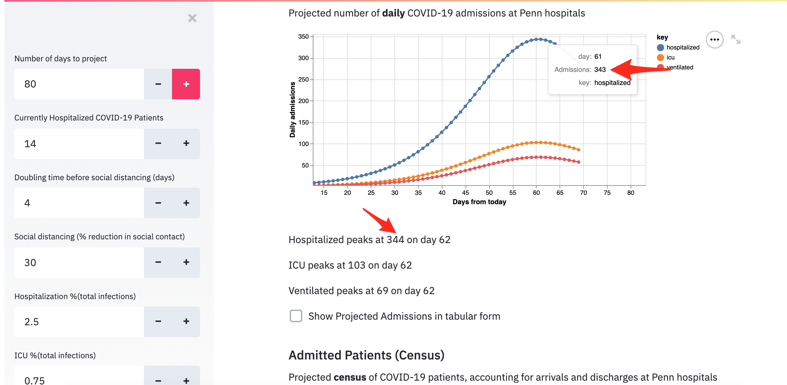
Description:
The tooltip (when you hover over a dot on the chart) rounds the number, whereas the description underneath the chart that shows the max value uses a ceiling (rounds up). This can cause a discrepancy between the two values.
Steps to reproduce:
- Increase "number of days to project" to where the chart shows the lines decreasing again
- Hover over the peak dot and observe the value
- Compare that value to the description below the chart
Expected behavior:
The numbers should be the same
What I got instead:
In fixing this, please add a test that confirms these numbers are the same, if possible.
Note: There is also an off-by-one issue (#239), but that is why the screenshot shows different days for the peak