Skip to content

Conversation

rezrah
Copy link
Collaborator

@rezrah rezrah commented Aug 19, 2022

Summary

form components example in light and dark mode side by side

Adds a FormControl, Select, Checkbox and TextInput component as part of https://github.com/github/primer/issues/1122

These components use a mixture of patterns from Primer React and Primer Rails equivalent components.

List of notable changes:

  • added four components for early testing: FormControl, TextInput, Select, Checkbox
  • added docs and storybook playgrounds for individual components
  • added layout example for GitHub Enterprise sign up form to both docs and storybook

Out-of-scope in this pull request

  • Smaller button sizes

What should reviewers focus on?

Documentation preview

Storybook preview

  • Review proposed API for suitability
  • Review component performance, which has been optimised for pure rendering with minimal internal state management
  • Review accessibility through Storybook Axe plugin

Steps to test:

  1. Review the docs and storybook playground to ensure the form control and inputs work as expected
  2. Verify that FormControl and TextInput appears as expected in the Figma file.

Supporting resources (related issues, external links, etc):

Contributor checklist:

  • All new and existing CI checks pass
  • Tests prove that the feature works and covers both happy and unhappy paths
  • Any drop in coverage, breaking changes or regressions have been documented above
  • New visual snapshots have been generated / updated for any UI changes
  • All developer debugging and non-functional logging has been removed
  • Related issues have been referenced in the PR description

Reviewer checklist:

  • Check that pull request and proposed changes adhere to our contribution guidelines and code of conduct
  • Check that tests prove the feature works and covers both happy and unhappy paths
  • Check that there aren't other open Pull Requests for the same update/change

Screenshots:

New leading and trailing text props

Screenshot 2022-08-22 at 07 52 39

Screenshot 2022-08-22 at 07 52 43

@changeset-bot
Copy link

changeset-bot bot commented Aug 19, 2022

🦋 Changeset detected

Latest commit: 459ba5f

The changes in this PR will be included in the next version bump.

This PR includes changesets to release 1 package
Name Type
@primer/react-brand Minor

Not sure what this means? Click here to learn what changesets are.

Click here if you're a maintainer who wants to add another changeset to this PR

@github-actions
Copy link
Contributor

github-actions bot commented Aug 19, 2022

🟢 No design token changes found

@github-actions
Copy link
Contributor

github-actions bot commented Aug 19, 2022

⚠️ Visual differences found

Our visual comparison tests found UI differences.

Please review the differences by using the test artifacts to ensure that the changes were intentional.

Artifacts can be downloaded and reviewed locally.

Download links are available at the bottom of the workflow summary screen.

Example:

artifacts section of workflow run

If the changes are expected, please run npm run test:visual:update-snapshots to replace the previous fixtures.

Review visual differences

@rezrah rezrah temporarily deployed to github-pages August 19, 2022 16:43 Inactive
@rezrah rezrah temporarily deployed to github-pages August 19, 2022 17:21 Inactive
@rezrah rezrah temporarily deployed to github-pages August 20, 2022 15:54 Inactive
@rezrah rezrah temporarily deployed to github-pages August 21, 2022 17:40 Inactive
@rezrah rezrah temporarily deployed to github-pages August 22, 2022 06:53 Inactive
@rezrah rezrah requested review from ashygee and langermank August 22, 2022 06:56
@rezrah rezrah marked this pull request as ready for review August 22, 2022 06:56
@rezrah rezrah added the brand label Aug 22, 2022
@rezrah rezrah temporarily deployed to github-pages August 22, 2022 07:00 Inactive
@rezrah rezrah temporarily deployed to github-pages August 22, 2022 16:15 Inactive
@rezrah rezrah temporarily deployed to github-pages August 24, 2022 07:42 Inactive
@rezrah rezrah temporarily deployed to github-pages August 24, 2022 08:18 Inactive
@rezrah rezrah temporarily deployed to github-pages August 24, 2022 08:31 Inactive
@rezrah rezrah requested a review from colebemis August 24, 2022 15:36
@rezrah rezrah temporarily deployed to github-pages September 6, 2022 09:39 Inactive
Copy link

@ashygee ashygee left a comment

Choose a reason for hiding this comment

The reason will be displayed to describe this comment to others. Learn more.

Design/styling updates along with the removal of inset prop from the component API

</FormControl>
)

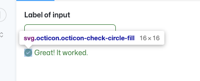
const errorIcon = container.querySelector('svg.octicon-alert-fill')
Copy link

Choose a reason for hiding this comment

The reason will be displayed to describe this comment to others. Learn more.

This is referencing the 12px icon but is being rendered at 16px. We should make an icon request to add and alert-fill 16px icon here since we are intending for larger validation messages.

Copy link
Collaborator Author

Choose a reason for hiding this comment

The reason will be displayed to describe this comment to others. Learn more.

Sorry @ashygee, not quite following on this one. Do you mean you want me to add a 16px SVG to Octicons and then pull it in here?

As it's a vector it will scale without distortion, so is that necessary? I've already bumped the validation text size in an earlier commit.

Screenshot 2022-09-07 at 16 21 03

@rezrah rezrah temporarily deployed to github-pages September 7, 2022 09:46 Inactive
@rezrah rezrah temporarily deployed to github-pages September 7, 2022 13:15 Inactive
@rezrah rezrah temporarily deployed to github-pages September 7, 2022 15:14 Inactive
@rezrah rezrah temporarily deployed to github-pages September 8, 2022 12:19 Inactive
@rezrah rezrah temporarily deployed to github-pages September 8, 2022 12:28 Inactive
@rezrah rezrah requested a review from ashygee September 8, 2022 14:08
@mperrotti
Copy link
Contributor

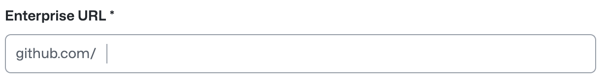
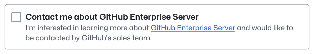
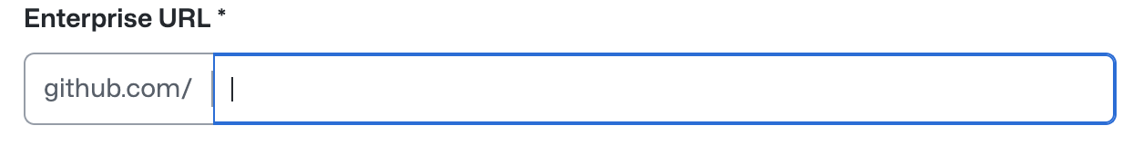
Love where this is headed. My main feedback is that there are some decorative borders that I think should use the default border color.

The border between the "leading text" and the input, which looks like a cursor:
Screen Shot 2022-09-08 at 1 48 57 PM

The border around the "Contact me" checkbox looks too much like a text or select input:
Screen Shot 2022-09-08 at 1 49 12 PM

@mperrotti
Copy link
Contributor

A few more design notes:

The checkbox isn't keyboard accessible when it's in a borded box:
https://user-images.githubusercontent.com/2313998/189192462-0754997c-b319-45ce-80f2-e9bba4ecb668.mp4

The checkbox animation feels a little slow, and it feels strange that the checkmark turns blue (as opposed to just the border) during the transition from checked to unchecked:
https://user-images.githubusercontent.com/2313998/189193112-52ffe661-fc24-4889-ac11-e55510d9b9f5.mp4

The focus style on a text input with a leading visual feels a little "off":

  • the blue border is smaller on the left side
  • there is a double border created by the focus border and the separator between the leading text and the input
  • I was expecting the whole input to have the blue focus border, but I can see why we might want to have the focus style on the part you type in
  • I was expecting the input to get focus even when I clicked the leading text, but I also think it's valid that clicking that area doesn't give focus. For reference, here is what we do in Primer React (video)

Screen Shot 2022-09-08 at 1 59 35 PM

Copy link

@ashygee ashygee left a comment

Choose a reason for hiding this comment

The reason will be displayed to describe this comment to others. Learn more.

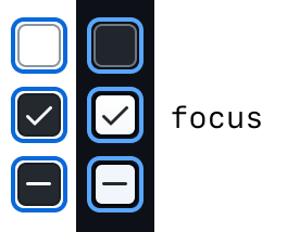
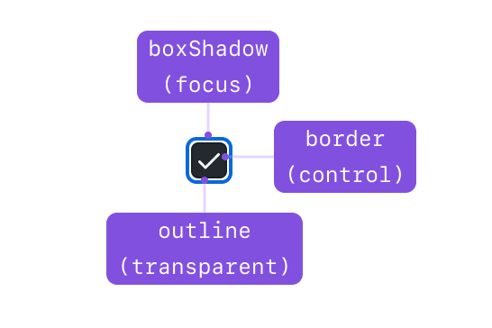
@rezrah all of this looks good to me and I really appreciate @mperrotti for sharing those insights as well. In regards to the focus state for the Checkbox input, this is the direction that we've agreed to go in:

Brand checkbox focus states

anatomy of checkbox borders

@rezrah
Copy link
Collaborator Author

rezrah commented Sep 9, 2022

This PR is getting quite large and given it's been open for a while, I'm going to merge and iterate on it over the next week in future (smaller) pull requests.

Changes that will be carried forward:

  • Updated Checkbox focus styles
  • Focus style for TextInput covering entire control (including leading and trailing text)
  • FormControl hasBorder prop to use brand-color-border-default
  • TextInput leading and trailing text inner divider to use brand-color-border-default
  • Check screen reader ordering with accessibility team

cc. @tobiasahlin @ashygee let me know if I've missed anything 🙏

@rezrah rezrah temporarily deployed to github-pages September 11, 2022 17:00 Inactive
@rezrah
Copy link
Collaborator Author

rezrah commented Sep 11, 2022

Latest update adds new focus styling to Checkbox, Select and TextInput controls.

Also fixed:

  • FormControl hasBorder prop to use brand-color-border-default
  • TextInput leading and trailing text inner divider to use brand-color-border-default
demo.for.new.focus.control.styles.mov

@rezrah rezrah temporarily deployed to github-pages September 12, 2022 09:34 Inactive
@rezrah rezrah merged commit 7838af5 into main Sep 12, 2022
@rezrah rezrah deleted the rezrah/add-formcontrol branch September 12, 2022 10:01
@primer-css primer-css mentioned this pull request Sep 12, 2022
Sign up for free to join this conversation on GitHub. Already have an account? Sign in to comment
Labels
Projects
None yet
Development

Successfully merging this pull request may close these issues.

5 participants