Skip to content

Conversation

manuelpuyol
Copy link
Contributor

Thanks @colebemis for the help!

This PR adds a way of toggling dark theme in the docs using the cmd + ctrl + t shortcut

@vercel
Copy link

vercel bot commented Mar 4, 2021

This pull request is being automatically deployed with Vercel (learn more).
To see the status of your deployment, click below or on the icon next to each commit.

🔍 Inspect: https://vercel.com/primer/view-components/8nHLRkALwMtUziNZR94f4DrRoaKe
✅ Preview: https://view-components-git-docs-dark-theme-primer.vercel.app

@vercel vercel bot temporarily deployed to Preview March 4, 2021 19:42 Inactive
@colebemis
Copy link
Contributor

Woo! I'm glad this worked.

Might be nice to add some border to the Box:
image

@vercel vercel bot temporarily deployed to Preview March 5, 2021 15:46 Inactive
Copy link
Contributor

@srt32 srt32 left a comment

Choose a reason for hiding this comment

The reason will be displayed to describe this comment to others. Learn more.

👍 💯 I wonder if we could add an issue to track adding a UI element to toggle the theme. Discovering the keyboard shortcut is very not obvious IME

@manuelpuyol
Copy link
Contributor Author

manuelpuyol commented Mar 5, 2021

👍 💯 I wonder if we could add an issue to track adding a UI element to toggle the theme. Discovering the keyboard shortcut is very not obvious IME

I think that's intentional since it isn't fully shipped yet?
The color modes branch has a button to toggle it, so I think that when that's merged we can work on it too https://primer-css-git-mkt-color-modes-docs-primer.vercel.app/css/components/labels

@manuelpuyol manuelpuyol merged commit 5a71b6d into main Mar 5, 2021
@manuelpuyol manuelpuyol deleted the docs-dark-theme branch March 5, 2021 15:59
@colebemis
Copy link
Contributor

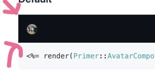
@srt32 From my PR in Primer React:

The keyboard shortcut is intentionally undiscoverable because it should only be used to visually test components as we migrate to functional color variables (part of the theming epic).
This is a temporary solution. When Primer React Components fully supports color modes, we'll be able to implement dark mode across the entire docs site instead of just the code examples.

primer/react#1095

Sign up for free to join this conversation on GitHub. Already have an account? Sign in to comment
Labels
None yet
Projects
None yet
Development

Successfully merging this pull request may close these issues.

3 participants