Make actual-sized images appear inline #261
Conversation
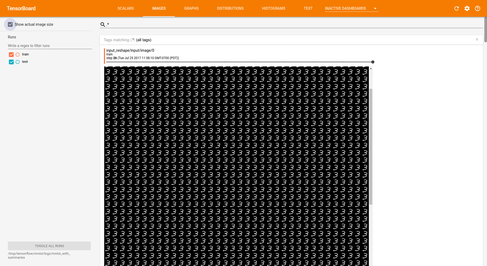
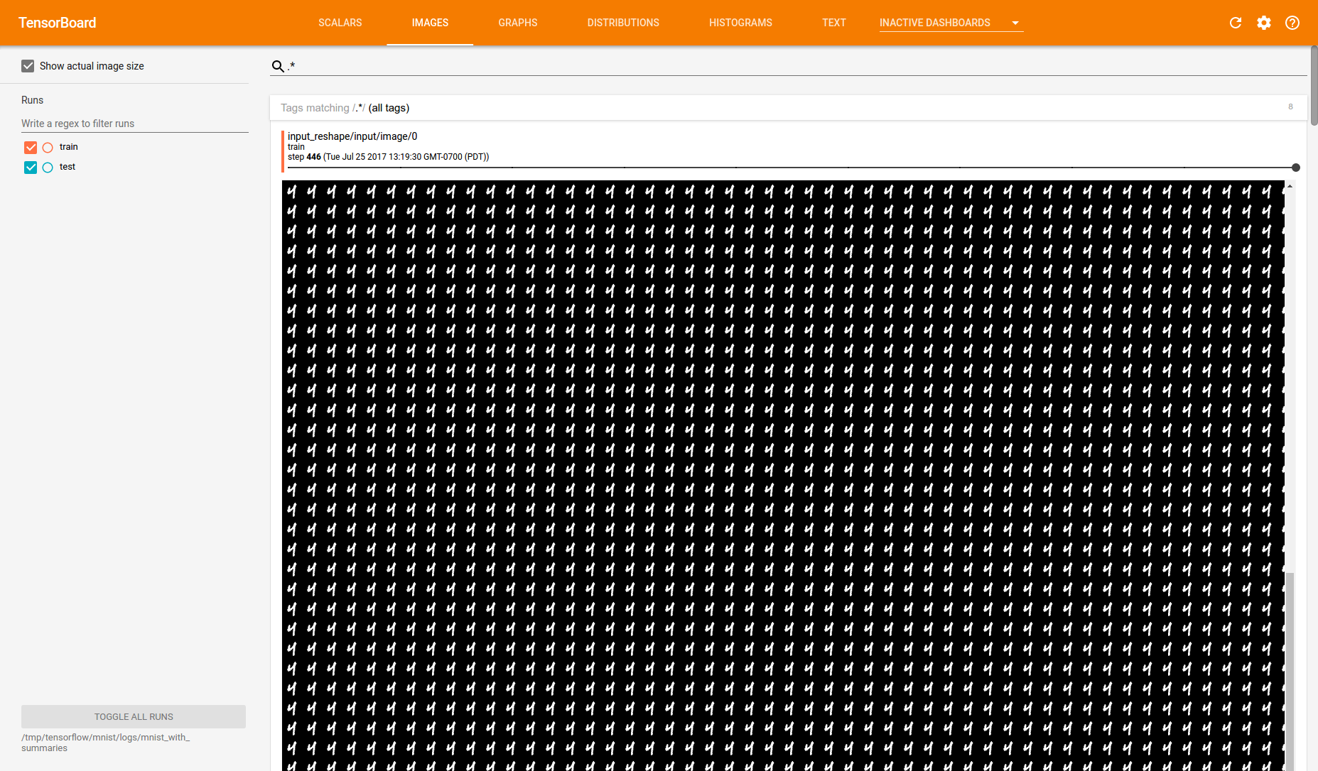
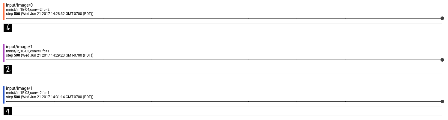
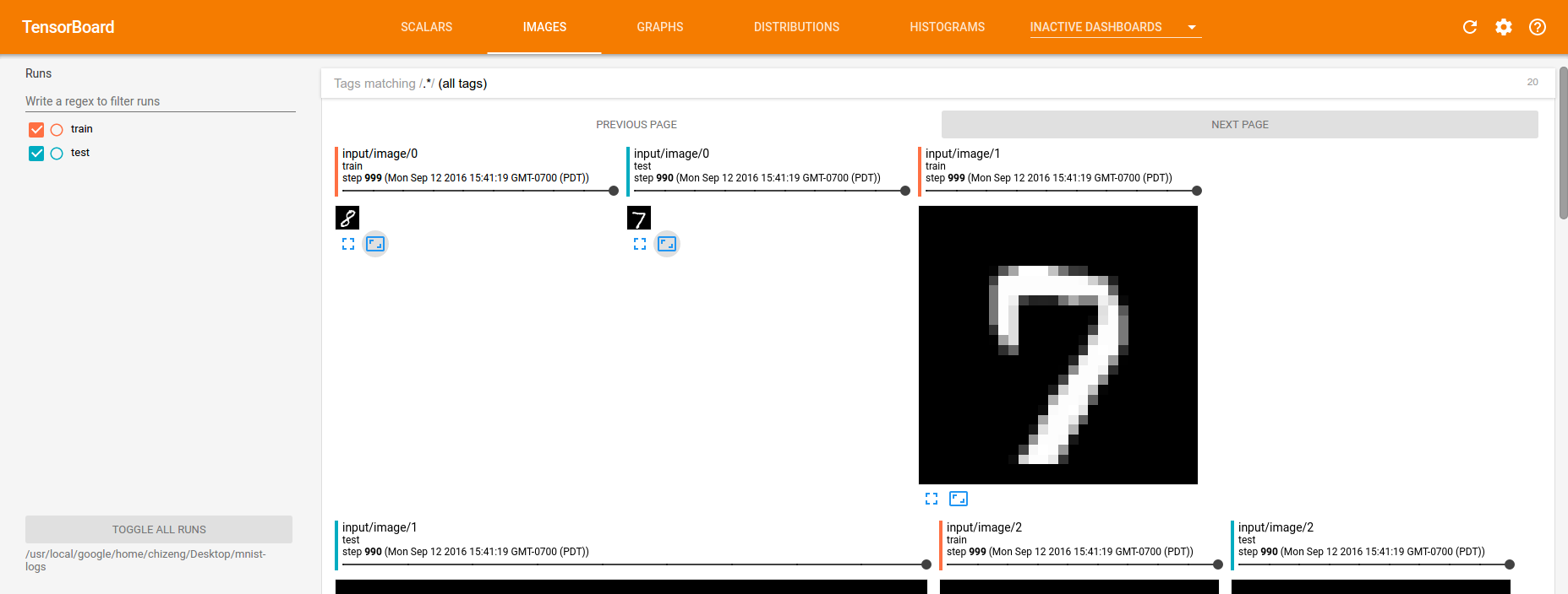
Previously, clicking the icon that displayed images in their actual sizes would make the images appear against a dark background (within a dialog). This change makes actual-sized images appear within the image loaders themselves.

This lets users compare between different images sized according to their actual dimensions. It also lets users slide across steps.
There was a problem hiding this comment.
There shouldn't be a period here; tooltips don't have punctuation. (e.g., "Click to go back, hold to see history").
Also, this tooltip is too verbose; suggest "Show actual size".
There was a problem hiding this comment.
Why would someone want to do this instead of showing the image at actual size?
(Also, if we do keep this feature, the tooltip is too verbose; suggest "Fill width".)
There was a problem hiding this comment.
nit: descendant (sp.) (but see below: we should be able to nix this function)
There was a problem hiding this comment.
Add reflectToAttribute: true, // for CSS in the definition of the _actualSizeShown property, and then it will work. See _expanded for an example. (Then we can get rid of this function, increasing the declarative:imperative ratio.)
I suspect that the selector that you want is :host[_actualSizeShown] #main-image-container img.
There was a problem hiding this comment.
The odd thing is ... I don't think :host[_actualSizeShown] #main-image-container img and setting reflectToAttribute: true does anything, which actually defied my expectation, so that's why went this route. Let me chat offline.
|
@wchargin, indeed, I think we can delete the expand button given this change to reduce confusion. I can't think of a compelling use case for it. I think some users like to expand confusion matrices, which are otherwise tiny images, but the default is already to somewhat expand them to an often reasonable size. |
|
Okay—in my opinion it would be best to incorporate that change into this PR. @dandelionmane do you support this plan? (tl;dr: In image dashboard, remove "expanded" and "actual size" buttons, and replace with an "actual size" button that shows the image inline at actual size.) (Unrelated nit: git commit titles are imperative. Here is the de facto commit message specification/style guide, including the justification for why titles are imperative. ("This convention matches up with commit messages generated by commands like |
|
Three thoughts:
|
|
The screenshot looks great, thanks! I would actually prefer a dashboard level toggle as @dandelionmane suggests. If that's hard to do, I can get by without it. For my GAN jobs, I already concatenate a lot of images into one big grid image. Biggest concern about the PR: The demo isn't working for me. When I click the button, it becomes selected, but the image doesn't resize. Clicking the button again doesn't de-select it. Let me know what I can do to help reproduce / debug. |
|
It should be easy to make this a dashboard-level setting.
Can repro. Fix: use |
 chihuahua
changed the title
chihuahua
changed the title
|
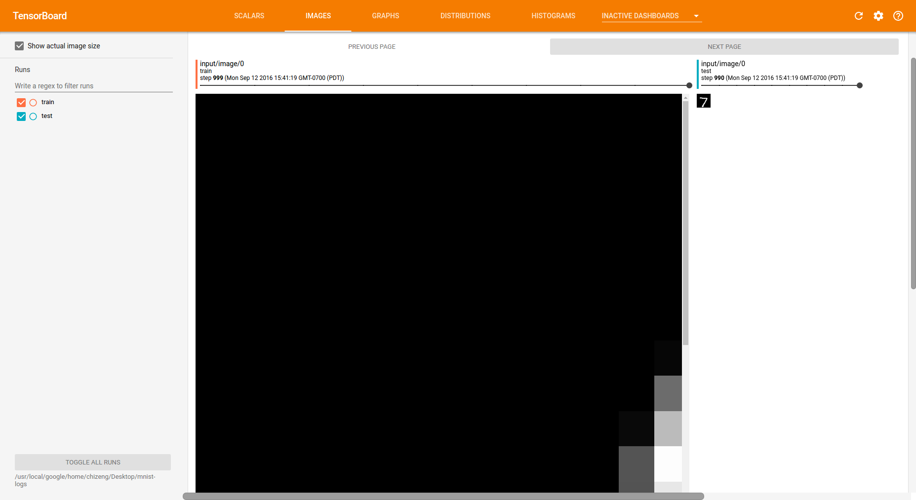
As mentioned in person, I'd also like to verify that this PR does the right thing when "show actual size" is clicked on an image whose true dimensions are very large. Suppose that the image is 2000×2000 px, and the inner width of the category (the pane reading, e.g., "Tags matching / (edit: superseded by Ian's comments below)
|
|
As an image generation researcher, I require the ability to display images at actual size for images up to 1024x1024. Viewing 1024x1024 images scaled down to 1000x1000 would introduce scaling artifacts and I would not be able to see which artifacts come from my image generation model and which come from TensorBoard. I would prefer to have 2000x2000 images displayed at 2000x2000. If it's necessary to show them within a smaller card, I would want the "show actual size" button to cause them to be displayed at actual size and activate scrolling within the card, similar to how viewing images at actual size in Photoshop/Gimp/eog works. But if something weird happens for images larger than 1024x1024, I can work around that by always chopping my images into chunks of size 1024x1024. |
Okay: makes sense. We should be able to do that. Thanks for the input. |
|
Very welcome, thanks for working on this feature! |
|
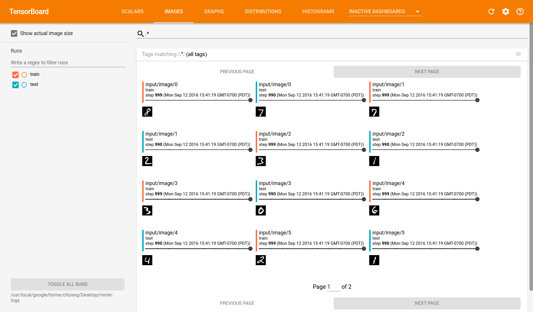
I also like showing actual size (dashboard-level toggle) and scrolling if any dimension > 1024px. My latest commit removes the icons under each image + introduces the dashboard-level toggle. PTAL
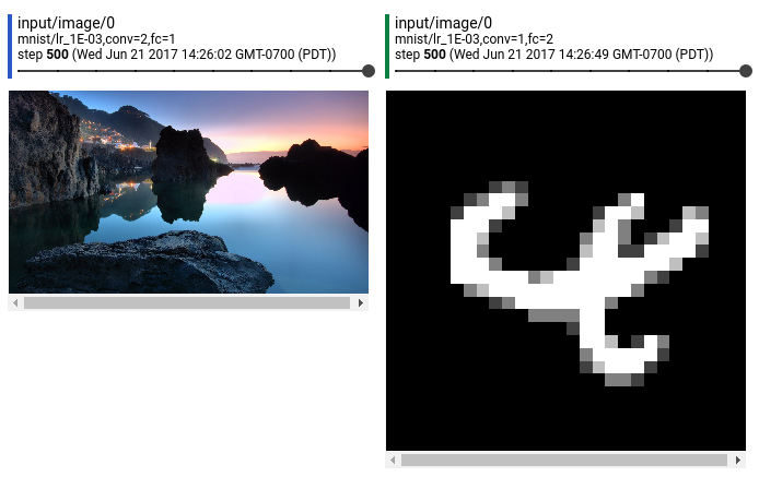
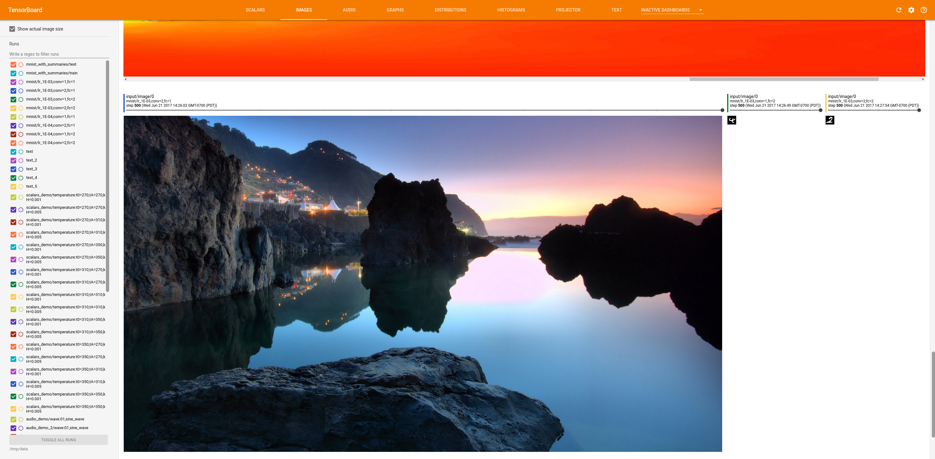
To generate 2242x2242 images, I just tiled mnist digits 80 times in both directions. |
|
First, cards should be bounded by the width of their container. (As it stands, if your window is smaller than your card and your card is smaller than your image, then you have two horizontal scrollbars, and there's no reason for that to be the case.) Second, why do we want to arbitrarily limit the cards to 1024px × 1024px? It's sufficient to just let cards expand as much as they need to support their image, bounded by the width of their container. Third, can we only set What do you think about the following style changes: add |
|
(Want to point out re: the last screenshot I posted: there's a horizontal scrollbar in the very-big image, but not in the medium or small images, and there is also no horizontal scrollbar in the main page.) Also, one nit (mentioning now to reduce number of review cycles): what do you think about renaming |
|
@wchargin, those are all terrific ideas. I updated the demo. PTAL. The scrollbar had been caused by a border on the image (which I moved to the container). Now, you should only ever see scrollbars if
|
|
That makes sense: it's okay for there to be a vertical scrollbar in non-actual-size mode if the image is tall. Thanks for making the changes; I'll take a look. |
|
First: you do want to use Second: if the purpose of the border was to delineate the edges of the image in the case where the image is mostly white [1], then moving the border to the container defeats this purpose for the right edge. It also makes the border look pretty tacky, IMO (see previous screenshot). [1]: It's not clear to me that this goal is a worthy one or that the border is worth its weight. Third: why do we want to include For convenience of others, here's my testing methodology: disable reload and use inspect-element to change the image sources to something large for testing. In particular:
|
There was a problem hiding this comment.
Why? I know that you added a 2px-total border to the image container, but you removed one from the image, so it should be par for the course, right? (It's also not necessary to try to preserve the absolute dimensions of all UI elements when changing other things. There's a reason that we don't do screendiff testing.)
There was a problem hiding this comment.
The previous width was actually awry and excluded the border, although this did not make a difference in practice because it did not affect positioning.
|
For my purposes, it's best if images are as tall as they need to be.
…On Tue, Jul 25, 2017 at 1:49 PM, William Chargin ***@***.***> wrote:
***@***.**** commented on this pull request.
------------------------------
In tensorboard/plugins/image/tf_image_dashboard/tf-image-loader.html
<#261 (comment)>
:
>
<style>
:host {
display: block;
- width: 330px;
+ width: 332px;
Why? I know that you added a 2px-total border to the image container, but
you removed one from the image, so it should be par for the course, right?
(It's also not necessary to try to preserve the absolute dimensions of all
UI elements when changing other things. There's a reason that we don't do
screendiff testing.)
—
You are receiving this because you were mentioned.
Reply to this email directly, view it on GitHub
<#261 (review)>,
or mute the thread
<https://github.com/notifications/unsubscribe-auth/AAXrGljAsxGkWrF1v_onz6UX3f3wbpV2ks5sRlS9gaJpZM4OhhkI>
.
|
|
I removed the border. Indeed, it might not be worth it. I think we want to keep the max height for now because of internal issues like this:
I also think it might be worth having the image always take up the whole page in actual size mode because otherwise, when images differ in height, it's easy to miss the small images that reside in the gaps,
whereas all images taking the full width confers consistency. |
Indeed, this makes sense when the dashboard is not in actual-size mode. But it's not relevant in the actual-size case: the user's image is actually 1×320, and thus it will appear. (To be clear: I'm only referring to the case where actual-size mode is active; when that's not the case it absolutely makes sense to have a
I see your point, though I'm not convinced; even a 1×1 will require at least the ~350px of space for its enclosing card—a card that has a colored border that draws the eye. In the case where images are small (e.g., MNIST), forcing one-image-per-line increases the vertical scroll amount by a factor of ~5, and further devalues small multiples. But I'll leave this one up to you. |
|
When enormous images render in actual-size mode, the user would have to scroll to navigate it anyway, so I think the question is whether we want them to navigate within a 1024x1024 container or use viewport scrolls. Maybe the former is preferable because the user could then scroll to the next image more easily. That would also let users compare sub-sections of images. Yeah, lets try that out. 350px is a good minimum width, and I think a common scenario is that the images will have the same dimension anyway. Basically, this looks good to me:
PTAL |
Good point, and agreed. Per offline discussion, we'll try out a version without the arbitrary 1024px-height-limit (in accordance with Ian's suggestion) and see what people think. |
There was a problem hiding this comment.
The code looks good to me once this line is removed, per our discussion!
|
PTAL The latest demo has no height limit when actual-size is true. Indeed, when your image is that big, it seems rather arbitrary to apply a 1024px height limit. |
Removed the icons under each image loader that had varied the image within that loader. Scrolling is enabled if the image is larger than 1024px in any dimension.
|
Done. Demo is updated. |
| } | ||
|
|
||
| #main-image-container { | ||
| max-height: 1024px; |
There was a problem hiding this comment.
Looks good to me once this line is removed!
There was a problem hiding this comment.
Up above, I added
:host[actual-size] #main-image-container {
  max-height: none;
}
Its selector is more specific, so it overrides this one.
|
Thanks @chihuahua ! |
|
Running Thank you to William for all the good ideas. |
|
Thanks!
…On Tue, Jul 25, 2017 at 6:29 PM, Chi Zeng ***@***.***> wrote:
Merged #261 <#261>.
—
You are receiving this because you were mentioned.
Reply to this email directly, view it on GitHub
<#261 (comment)>, or mute
the thread
<https://github.com/notifications/unsubscribe-auth/AAXrGgDIXaHtMSvlQSUwPCnab1KdC8Qwks5sRpZxgaJpZM4OhhkI>
.
|
|
Looks like you lost the triple-test lottery :-) In the future, you can just hit "Restart build" in Travis to re-run the flaky tests. |
Previously, clicking the icon that displayed images in their actual sizes would make the images appear against a dark background (within a dialog). This change makes actual-sized images appear within the image loaders themselves.
This lets users compare between different images sized according to their actual dimensions. It also lets users slide across steps.
Here is a screenshot. The 2 leftmost handwritten digits take on their actual sizes.
See issue #256.